I am not happy with the removal of Google Reader social features. I really enjoyed discovering new feeds following people.
Anyway, I don't mind the new look but it leaves too little readable space. A couple of years ago I blogged about how to use Firefox's userContent.css to optimize the layout.
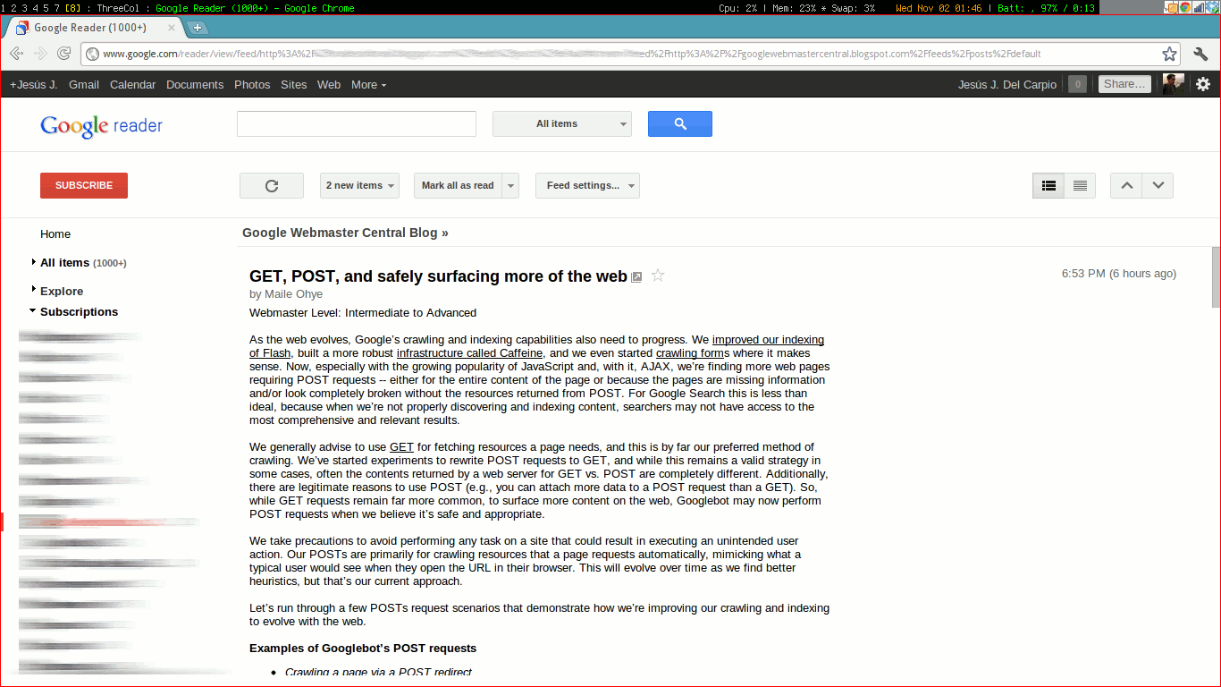
Here's how the new layout looks at the moment:
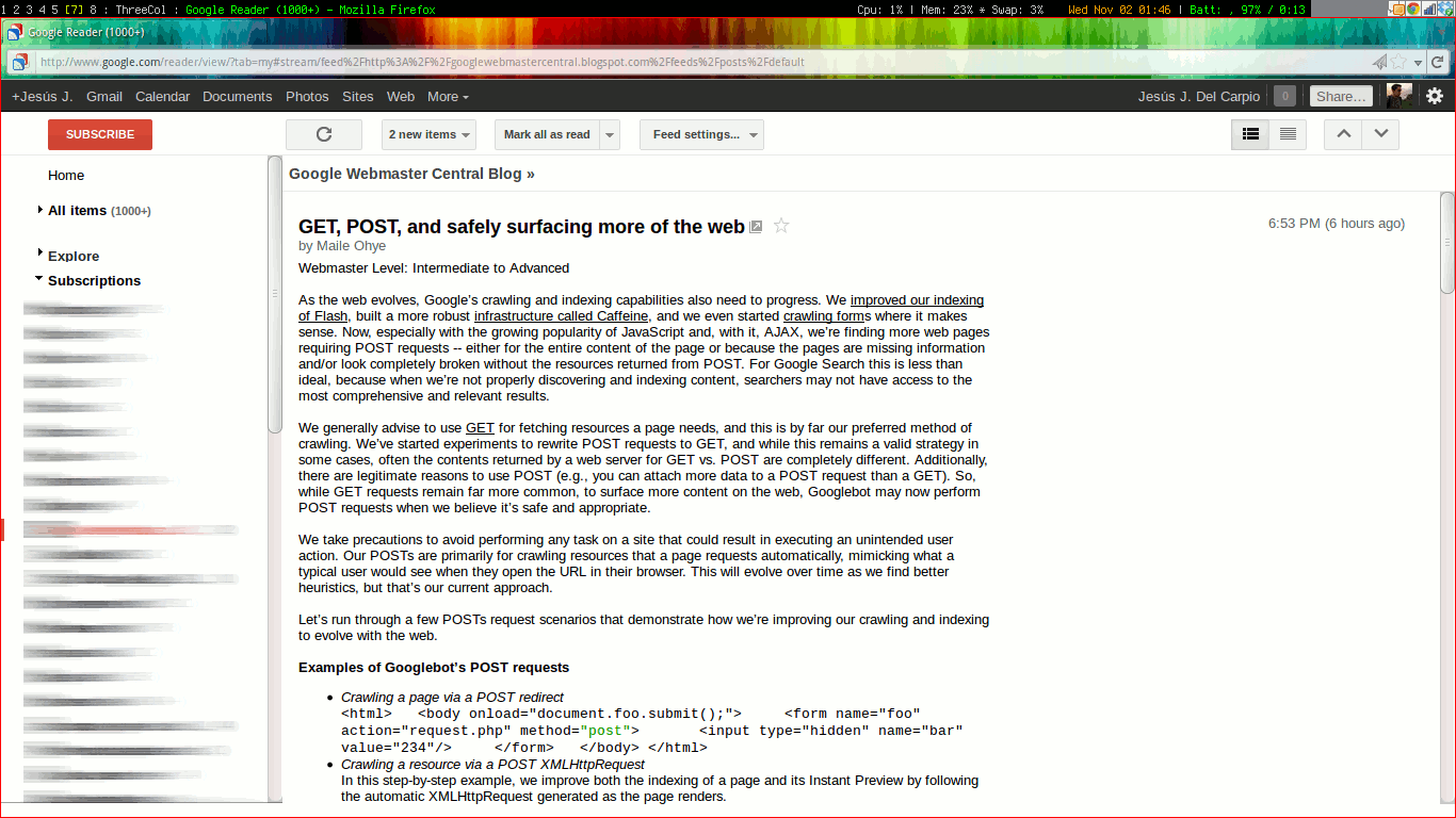
Here's what it will look like (Notice the vertical space in the reader area):
This is what you need to add to your #userContent">userContent.css file.
@-moz-document url-prefix(http://www.google.com/reader/) {
    #top-bar {
    display: none;
    }
}
/* For some reason I had to take this out of @-moz-document */
body.gecko #lhn-add-subscription-section, body.gecko #viewer-header {
height: 40px !important;
}
Switching to full screen F plus Sift + U sort of does the trick as well, but I don't like having the whole screen's width to read as lines become too long.
Comments
#371134" title="2011-11-02 08:22:00">Azri Rashid: thanks
#371386" title="2017-08-09 03:00:56">Azri Rashid: